
Page History
| Table of Contents | ||
|---|---|---|
|
Reports/Dashboard menu will be displayed as Dashboard if the installation has Dashboard license else it will be displayed as Reports
| Info | ||
|---|---|---|
| ||
|
What is the dashboard?
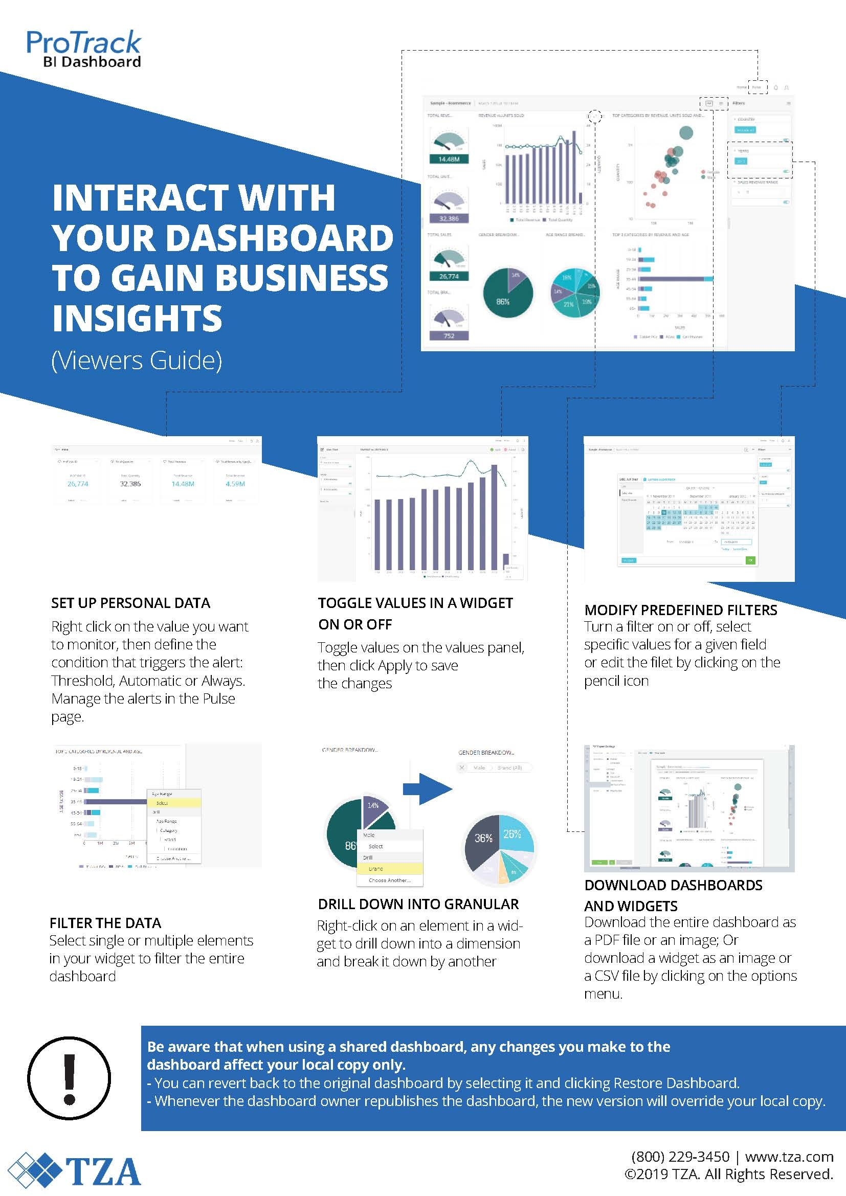
The dashboard is a powerful tool that allows users to utilize an advanced data analytics engine to visualize and trill into ProTrack's labor management data. The Business Intelligence (BI Pro) tool requires no technical knowledge to create data visualizations which can be easily filtered and explored. By default, there are several included dashboards which cover many of the most common labor management KPIs. Users can duplicate, extend, and customize these dashboards to cover additional reporting needs. Additional dashboards can also be created from scratch as dictated by business needs.
Accessing the Dashboard
- Log into ProTrack Warehouse.
Select Dashboard from the Reports drop down menu
- Dashboard screen has three sections:
- Analytics
- Pulse
- Notification
Analytics
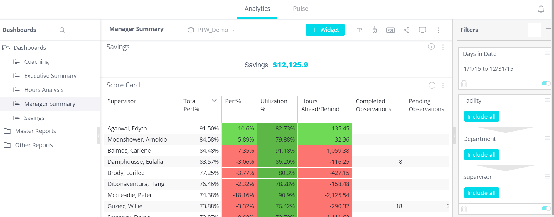
Fig 1 Dashboard Screen - Analytics
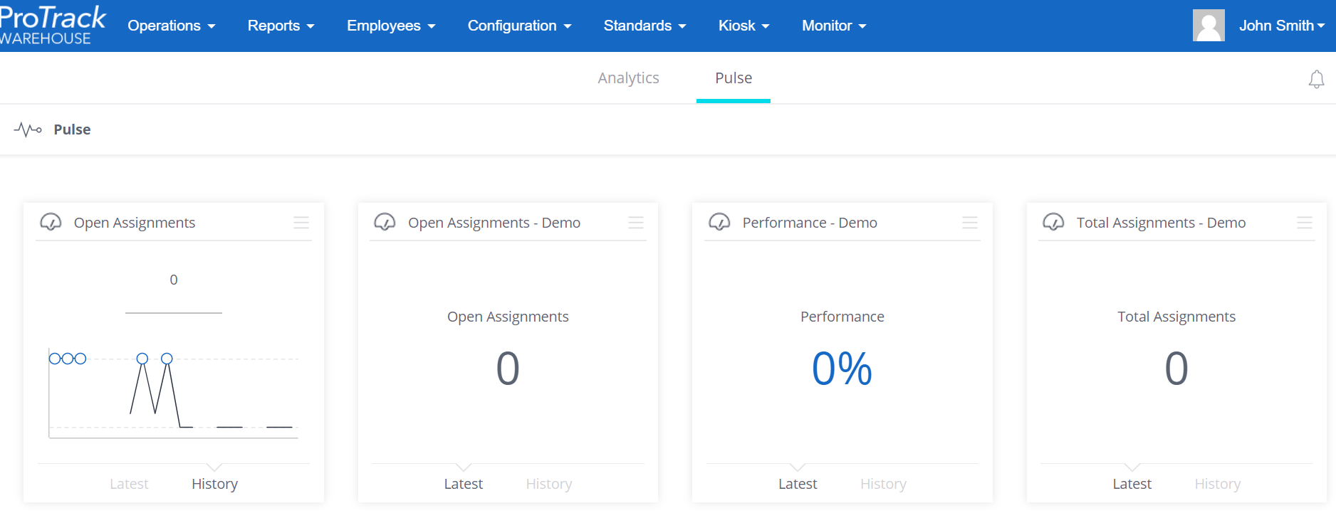
Pulse
Clicking on ![]() will show the pulse.
will show the pulse.
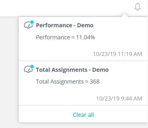
Notification
Clicking on ![]() will show the notifications
will show the notifications
How to use Dashboards
The Dashboard provides the user the ability to see information at any level with full drill down capability.
From the top menu, select Reports → Dashboard
Dashboard Features
Analytics
The Analytics tab contains all of the Dashboards that have been created by, or shared with, the logged in user. Choosing a dashboard from the left-hand menu loads the dashboard in the middle pane. The right panel contains a list of filters that can be applied to all widgets on the currently selected dashboard to see data for a specific date range, set of facilities, group of employees, etc.
Dashboards
By default, several dashboards have been created with most of the commonly used labor management KPIs in mind.
| Dashboard Name | Description |
|---|---|
Coaching | The Coaching Dashboard contains several metrics related to observations. |
| Daily Analytics | The Daily Analytics Dashboard includes most information a supervisor would want to view on a daily basis. Widgets related to Performance, Utilization, and Volumetrics are found here. |
| Executive Summary | The Executive Summary Dashboard contains several charts and graphs which allow executives to track cost and performance metrics across multiple facilities at a glance, all in one place. |
| Hours Analysis | The Hours Analysis Dashboard allows visibility into the numbers of hours behind or ahead of standard. Graphs and charts on this report break this information down by Activity and Employee. |
| Manager Summary | The Manager Summary Dashboard tracks performance and utilization metrics across multiple facilities, further broken down by supervisor and employee. This Dashboard also includes performance trends and volumetrics. |
| Savings | The Savings dashboard shows the amount of actual dollars saved by tracking and improving the performance of your employees, based on the difference in performance from when the software was first implemented. Widgets include data broken down by week, month, and facility. |
Pulse
What is Pulse?
Your pulse is a centralized location where you can stay on top of your most important KPIs across multiple dashboards, and manage your data alerts.
You can consolidate and monitor important aspects of your business by adding important values from various dashboards to the Pulse page.

Adding a tile to your Pulse
Widgets with single values can be added to your pulse by hitting the 3 dots in the upper-right corner of the widget.

Alerting can be set for each widget individually as they are added to pulse. There are three ways this alerting can be set up:
- Threshold – Once a value rises above/falls below a certain number, an Alert will be generated
- Automatic – Pulse will automatically check for variations from the normal, and send an Alert when an abnormal value is detected.
- Always – An Alert will be generated each time the cube rebuilds, regardless if there is a change in your data or not.
The Advanced button allows you to customize the filters on the Pulse, and where Alerts will be sent when they are generated.
Notification
Clicking on ![]() will show the notifications. Alerts generated by Pulse widgets will appear here.
will show the notifications. Alerts generated by Pulse widgets will appear here.
How to create a new Dashboard
How to add Pulse
How to add NotificationOverview
Content Tools