
Documentation for ProTrackWarehouse 2019.1.
Reports/Dashboard menu will be displayed as Dashboard if the installation has Dashboard license else it will be displayed as Reports
Info
- Individual Reports/Dashboards access can be controlled from Security Screen
- Reports will always be displayed as view only reports.
- Dashboards can be view only or editable depending on user's access rights.
Accessing Dashboard
- Log into ProTrack Warehouse.
Select Dashboard from the Reports drop down menu
- Dashboard screen has three sections:
- Analytics
- Pulse
- Notification
Analytics
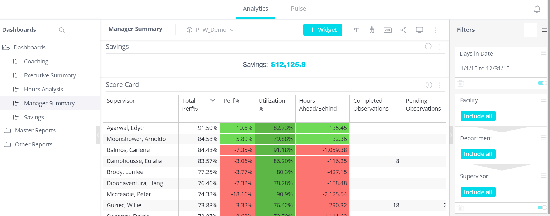
Fig 1 Dashboard Screen - Analytics
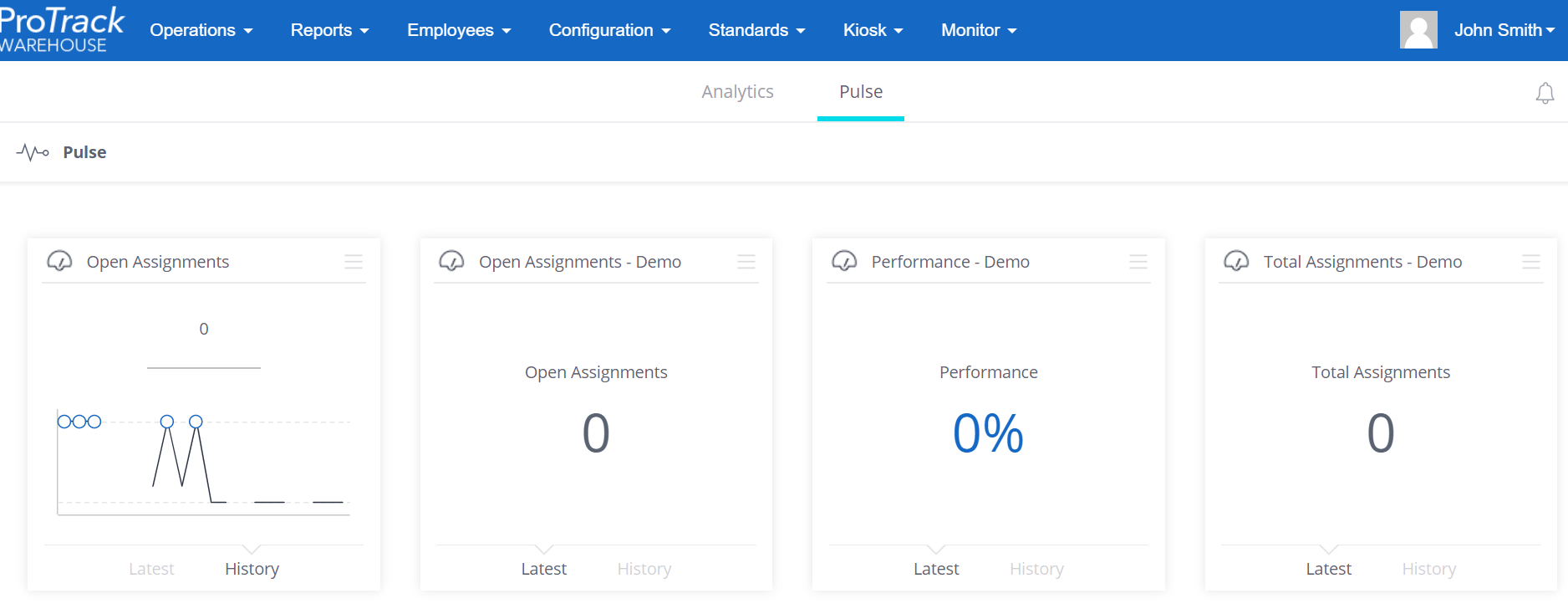
Pulse
Clicking on ![]() will show the pulse.
will show the pulse.
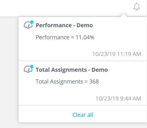
Notification
Clicking on ![]() will show the notifications
will show the notifications
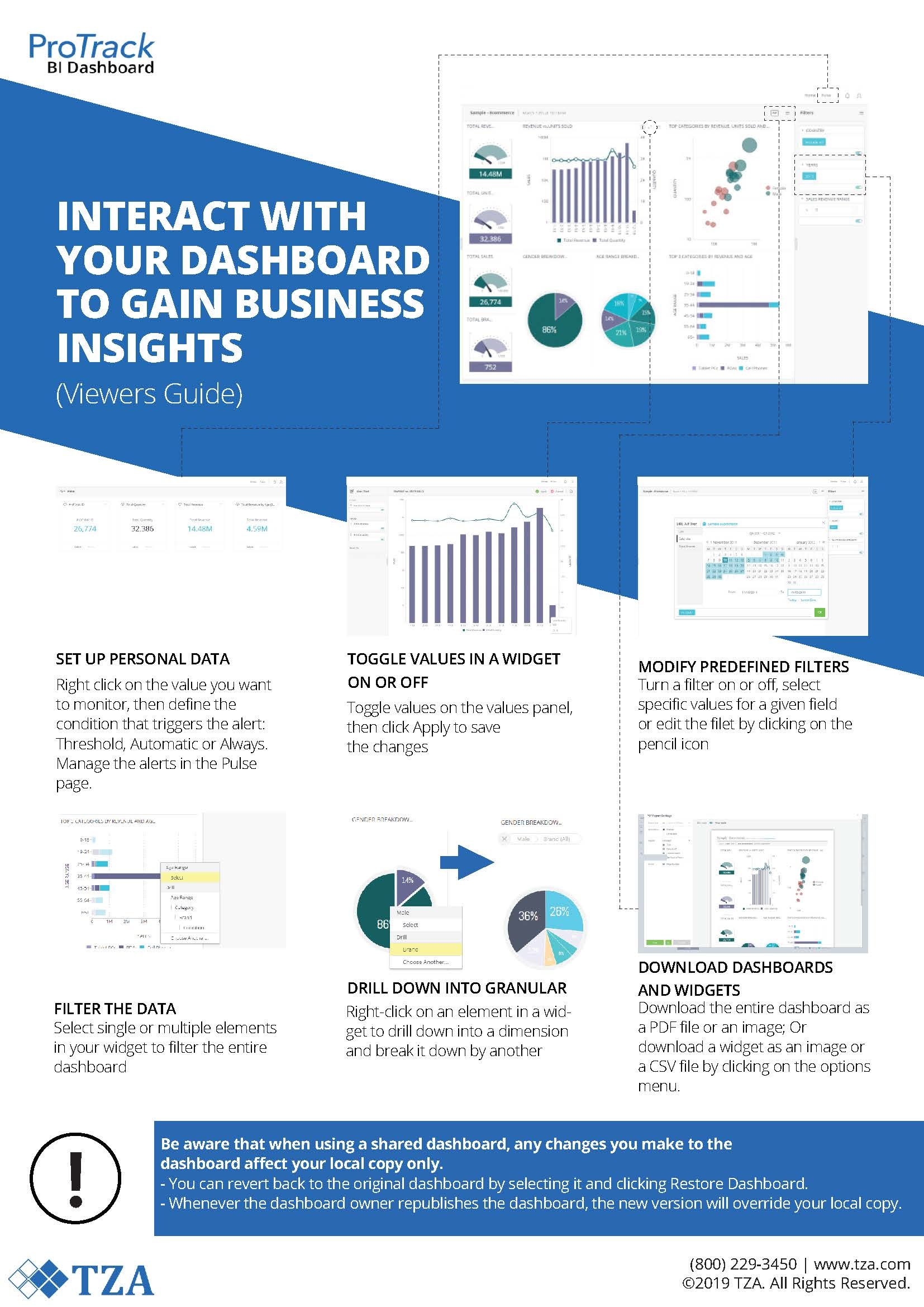
How to use Dashboards
The Dashboard provides the user the ability to see information at any level with full drill down capability.
How to create a new Dashboard
Dashboard Designers can create dashboards from the Analytics page where all your existing dashboards are displayed.
Create a New Dashboard
- Click + to create a new dashboard on the Analytics page.

- In the Data Set field, select the ElastiCube model to which you want to connect. If you’ve completed Step 1 – Connect to Data, select ‘Tutorial’ in the Data Set field, otherwise choose ‘Sample ECommerce’.
- A default title name matching the ElastiCube model name will be given to the dashboard. Feel free to change it.

- Click Create.
Now that you have a dashboard, you can start adding widgets to it.


2 – Create Your First Widget: Sales Trends
Create your first widget to get a general idea of your sales performance.
- Click Select Data on the left side of the screen:

- A list of available fields will be displayed grouped according to the table they belong to. This window is called ‘Data Browser’, and lets you easily find the fields available in your ElastiCube model. Select the ‘Revenue’ field:


Now you immediately get a ready made widget that shows you all revenue to date. We call this kind of widget an “Indicator”.
But to understand revenue over time, add a time field to the mix:
- Click + Add More Data:

- In the data browser, hover over the Date field and click More… Then select Quarters:

- Click Create to add the line chart widget to the dashboard.
The revenue trend is also positive showing annual growth, so now go ahead and explore what’s driving this growth. It would be interesting to uncover profitable product categories.


3 –

- You can clearly see that customers between the ages of 65+ are the most valuable in terms of the revenue they generate. This insight can be used to focus advertising budgets and develop unique campaigns to grow these customer segments. Now, you can turn your attention to identifying which markets are growing at the quickest rate.
6 – Rearrange the Widgets in the Dashboard
You can rearrange the dashboard by dragging and dropping, and resizing the widgets. Dragging one widget on top of another splits the area in the dashboard and allocates space for both widgets.
See this animation to get a feeling of how to rearrange widgets:
Go ahead and rearrange your dashboard however you see fit.
You can now easily see all four visualizations showing sales trends, product mix, customer segments and fast growing markets. You can explore and drill into the details to get further insight.
7 – Filtering and Drill Downs
In our pie chart we can clearly see that our strongest age range is 65+. Let’s explore this age range a little more:
- Click the 65+ slice in the pie chart.
- As a result, a new filter is added to the filter panel on the right, and the entire dashboard is now filtered to focus on this age range.
- Taking a look at the updated scatter chart, you can see that Monitors are by far the most revenue generating category for this age range.
- Right-click the 65+ slice in the pie chart and select Drill Into… from the menu.
- A Data Browser will pop up, letting you select any field to drill into. Click on the Brand field.
- You can now see which brands contribute the most to the revenue of your selected age range.
You can make direct selections by dragging the mouse over the points that interest you in the scatter and line charts as well.
How to add Pulse
How to add Notification
Overview
Content Tools